watercolr reflection: January 27, 2012.
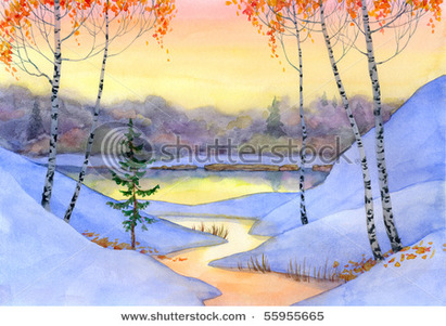
1.) what thought i did well was the colors, because i thought they all blend together very well. On one i love how my landscape blened equally.
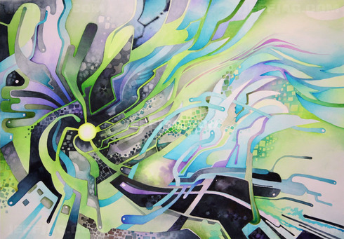
2.) On two of them things look sloppy and rushed and childish, because i couldnt really think what was really me so i tryed to stick with my strong suit and blending.
3.)for unity it was light blends not bold but simple. more water with the paint, and metalic (spelled that wrong) to make certain parts pop.
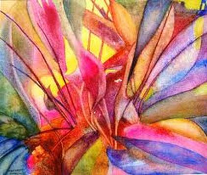
4.) i did a little bit of everything in each painting. one was earth tones because it was a landscape. another were main warm colors and secondary colors in another to make the flowers pop, and another was primary and secondary colors because i wanted to keep in range of the simpleness in the painting.
5.) the love how it has a soft feel to it and sometimes in cases cols you down and shows detail in certain things.
6.) i really like doing landscapes end of story :) i really neeed to take more time to find what i REALLY want to do because when i have passion and actually like what im doing it looks so much better.
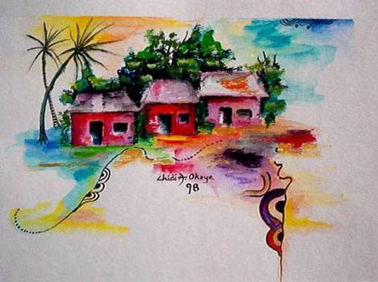
7.) i had a few ideas and in the end i only stuck with one, because it was my first painting i started it shows my life being up and down. one turned out better then i planned because i really like what i was doing and i put the most effort into it. and another shows how ive bloomed in life.
2.) On two of them things look sloppy and rushed and childish, because i couldnt really think what was really me so i tryed to stick with my strong suit and blending.
3.)for unity it was light blends not bold but simple. more water with the paint, and metalic (spelled that wrong) to make certain parts pop.
4.) i did a little bit of everything in each painting. one was earth tones because it was a landscape. another were main warm colors and secondary colors in another to make the flowers pop, and another was primary and secondary colors because i wanted to keep in range of the simpleness in the painting.
5.) the love how it has a soft feel to it and sometimes in cases cols you down and shows detail in certain things.
6.) i really like doing landscapes end of story :) i really neeed to take more time to find what i REALLY want to do because when i have passion and actually like what im doing it looks so much better.
7.) i had a few ideas and in the end i only stuck with one, because it was my first painting i started it shows my life being up and down. one turned out better then i planned because i really like what i was doing and i put the most effort into it. and another shows how ive bloomed in life.
watercolor is for all ages:)
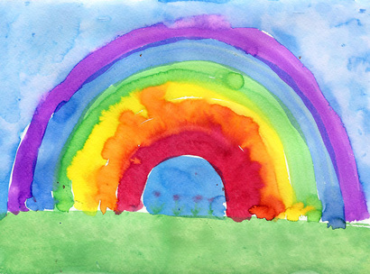
http://www.google.com/imgres?um=1&hl=en&biw=1024&bih=506&tbm=isch&tbnid=Ly9jZHettoOMZM:&imgrefurl=http://www.artprojectsforkids.org/2011/04/rainbow-painting.html&docid=rGoH5DyDzIhahM&imgurl=http://4.bp.blogspot.com/-_w0UbBY1vFw/TZu7qoQU1QI/AAAAAAAAFHY/eFSpUHPojDI/s1600/rainbow186.jpg&w=1056&h=782&ei=LggPT6y_EpGssALn06iGBA&zoom=1&iact=rc&dur=350&sig=101115524220047754224&page=1&tbnh=134&tbnw=181&start=0&ndsp=10&ved=1t:429,r:0,s:0&tx=93&ty=78
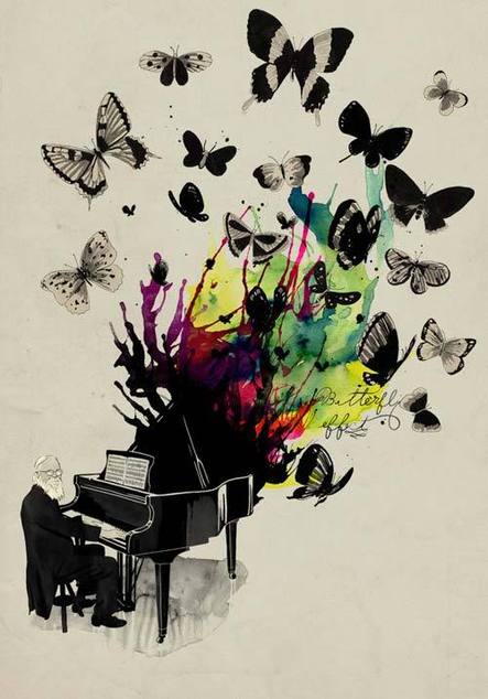
ilove how theartist uses both color and the black and white.
http://www.google.com/imgres?um=1&hl=en&sa=N&biw=1024&bih=506&tbm=isch&tbnid=paa8TwdJWDZHlM:&imgrefurl=http://weheartit.com/entry/5768498&docid=ukhC-HbVwgJNZM&imgurl=http://data.whicdn.com/images/5768498/butterfly_large.jpg&w=500&h=714&ei=LLMNT92FGOvJsQLZwf3gBQ&zoom=1&iact=hc&vpx=186&vpy=124&dur=45&hovh=268&hovw=188&tx=76&ty=244&sig=101115524220047754224&page=5&tbnh=130&tbnw=91&start=43&ndsp=14&ved=1t:429,r:8,s:43
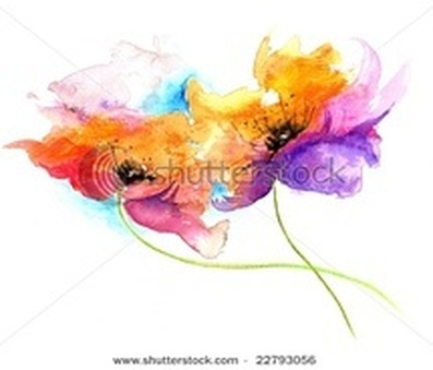
i love the blending in this.
http://www.google.com/imgres?um=1&hl=en&biw=1024&bih=506&tbm=isch&tbnid=pKpmzvv6gXa56M:&imgrefurl=http://vi.sualize.us/search/all/flowers/%3Fpage%3D8&docid=QLXrr7P5vw-m7M&imgurl=http://cdnimg.visualizeus.com/thumbs/bb/23/water,color-bb235a24a986bc1ad2bce9c3eee2ca86_m.jpg&w=215&h=184&ei=yQkPT7j2EKb0sQKXrazdAw&zoom=1&iact=rc&dur=310&sig=101115524220047754224&page=4&tbnh=123&tbnw=144&start=38&ndsp=13&ved=1t:429,r:9,s:38&tx=110&ty=44
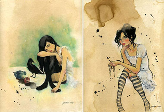
this looks somewhat reall and shows actually feeling in it like in the eyes
http://www.google.com/imgres?um=1&hl=en&biw=1024&bih=506&tbm=isch&tbnid=xRiLPkiYC8cMeM:&imgrefurl=http://training.sessions.edu/resources/interviews/index.asp&docid=wPntj7TF0bhJCM&imgurl=http://training.sessions.edu/resources/interviews/images/holly/Stella.jpg&w=380&h=258&ei=FQ0PT43QEs6psALd-PnvAw&zoom=1&iact=hc&vpx=456&vpy=121&dur=113&hovh=185&hovw=273&tx=198&ty=111&sig=101115524220047754224&page=1&tbnh=117&tbnw=156&start=0&ndsp=13&ved=1t:429,r:10,s:0
love the colors in it and the blending
http://www.google.com/imgres?um=1&hl=en&biw=1024&bih=506&tbm=isch&tbnid=pKpmzvv6gXa56M:&imgrefurl=http://vi.sualize.us/search/all/flowers/%3Fpage%3D8&docid=QLXrr7P5vw-m7M&imgurl=http://cdnimg.visualizeus.com/thumbs/bb/23/water,color-bb235a24a986bc1ad2bce9c3eee2ca86_m.jpg&w=215&h=184&ei=yQkPT7j2EKb0sQKXrazdAw&zoom=1&iact=rc&dur=310&sig=101115524220047754224&page=4&tbnh=123&tbnw=144&start=38&ndsp=13&ved=1t:429,r:9,s:38&tx=110&ty=44
watercolors
watercolor is a beautiful type of art. you can try ever technique and come up with differnt styles. such as Dropping in Color, Lifting Off, Wet in Wet, Glazing, Washes. The three i like are wet in wet, washes, and dropping in color. they are more used for mixig colors and showing a lot of blending in work. it seems to look more flowy.
it reminds me of the sun but with cool colors instead
http://www.google.com/imgres?um=1&hl=en&biw=1024&bih=506&tbm=isch&tbnid=KB3RT0_fvkoJxM:&imgrefurl=http://jeffjag.com/2d_watercolor1.php&docid=iNdNXtX0d-1mkM&imgurl=http://jeffjag.com/images/2d/paint/axiom_of_evil.jpg&w=1024&h=712&ei=nAwPT56hE6H4sQLi77yNBA&zoom=1&iact=rc&dur=465&sig=101115524220047754224&page=1&tbnh=128&tbnw=158&start=0&ndsp=10&ved=1t:429,r:7,s:0&tx=90&ty=35
this paiting makes u just wanna sile and feel light:)
http://www.google.com/imgres?um=1&hl=en&biw=1024&bih=506&tbm=isch&tbnid=SiT1szEwxd5KeM:&imgrefurl=http://www.margaret-hamlin-artist.com/&docid=Kkxx2GfTcuRPoM&imgurl=http://www.margaret-hamlin-artist.com/images/margaret_art.jpg&w=400&h=338&ei=lrUNT-meIOiFsgL1u_zXBQ&zoom=1&iact=hc&vpx=265&vpy=185&dur=1031&hovh=206&hovw=244&tx=174&ty=118&sig=101115524220047754224&page=1&tbnh=128&tbnw=158&start=0&ndsp=10&ved=1t:429,r:6,s:0
i love how he mixed real with abstracted
http://www.google.com/imgres?um=1&hl=en&biw=1024&bih=506&tbm=isch&tbnid=kj5VdWU50URyNM:&imgrefurl=http://kassidydart2.blogspot.com/&docid=g3MCNOCraUIJrM&imgurl=http://4.bp.blogspot.com/_pKmFRbaRnQY/TMBag-pmjII/AAAAAAAAAAU/mTghUCc8Lgw/s1600/watercolor2.jpg&w=440&h=318&ei=EAwPT5eGN8mhsQKRtYj5Aw&zoom=1&iact=hc&vpx=129&vpy=292&dur=251&hovh=137&hovw=190&tx=134&ty=125&sig=101115524220047754224&page=15&tbnh=124&tbnw=171&start=166&ndsp=11&ved=1t:429,r:0,s:166
